

Paula Scher is a graphic designer born in Washington DC in 1948. She is one of the most significant graphic designers of our time and is named the ‘Goddess of Graphic Design’ because of her ability to effortlessly engage the audience by just using type and how she presents it. (Abstract: Art of Design, 2019).
She is known for more than recognisable branding for companies such as Tiffany and co-, Citibank, Microsoft, the Public Theatre and so much more. She was hugely inspired by the designer Seymour Chwast in the 60s and 70s by his clever use of blending type and image which inspired many more artists. She ended up marrying him in 1973 and later again in 1989. She graduated from the Tyler School of Art in 1970 with a Bachelor of Arts degree and then moved to New York where she began her career in the world of design (Mundell Design History, 2017).
Paula Scher has an exceptionally long and interesting career in design that began when she graduated from the Tyler School of Art in 1970 where she then went to work as an artist at Random House. (Mundell Design History, 2017). A year later she was hired by CBS records and after a year left to become Atlantic Records Art Director, however she returned to CBS Records and stayed for a further eight years under the same title of art director. During this time, she created many album covers for artists and was nominated for four Grammys because of her design style. She was nominated in 1977 for Ginseng Woman and Yardbirds Favourites album, in 1978 for Heads and in 1980 for the One-on-One album. (Grammy, 2021). In her 50+ years of graphic designing, this was just the beginning. She left CBS Records in 1982 and started a business with a fellow classmate from the Tyler School of Art and named their graphic design company Koppel & Scher. After six years in business together, they parted ways due to the recession in the 90’s. Since that business venture, she joined the Pentagram Multidisciplinary Design Studio in 1991 (Famous Graphic Designers, 2021).
Paula Scher joined the Pentagram Studio in 1991 where she and 22 other designers all with distinctive design disciplines come together to collaborate on projects or work independently. It is the largest private design company in the world, established in 1972 by Alan fletcher, Colin Forbes, Kenneth Grange in London, and over the years have expanded their studios in cities such as New York, San Francisco, and Austin, Texas. The main reason for The Pentagram is to bring together artists who are experts in their own disciplines, come together and collaborate with each other to construct highly intricate designs. Before Paula joined Pentagram, she was seen by the studio as the “master conjurer of the instantly familiar” (Pentagram, 2021), which means they noticed she had the ability to manipulate her use of typography in a certain way that caught the attention of so many people as well as other artists. Still Today she is still based in New York and is a principal of Pentagram after 30 years of design. In the many designs that she has created whilst working with Pentagram, one of her most instantly recognisable pieces is her 1996 The Public Theatre poster for ‘Bring Da Noise Bring Da Funk’. Noise/Funk became extremely popular where it was used as a guide for how other Broadway shows were to be advertised as well as other clients wanting their branding in that style. Her branding for Noise/Funk made her even more recognisable and desired in the world of design. (Scher, Twenty-Five Years at The Public, 2020).

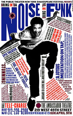
Figure 1 & 2: (P. Scher, Pentagram, The Public Theatre, 1996). She created these posters for ‘Bring In Da Noise, Bring In Da Funk’ at the Public Theatre.
“My work is very much influenced by New York, it’s probably the biggest influence on the work now I realised the way I designed them had much more to do with packing things in the way New York City is packed in. My work tends to be loud. It tends to be out of scale like New York” (Paula Scher, Design Indaba, 2021)
Paul Scheer is known for her branding identity in the graphic design world. She has designed for the Public Theatre, Tiffany and co, Citibank, Windows 8, The New York City Ballet and much more. She has designed for smaller companies like Jazz at Lincoln Centre where 12 years after designing their logo, she redesigned it because it looked outdated. She took away the ‘at Lincoln Centre’ replaced it with a bolder font for ‘Jazz.’ She focused on circles for Jazz and turned the ‘A’ into a vinyl and she also did this with the round letters of the alphabet and so created a more recognisable design when they advertise themselves, thus creating more recognition.


Figures 3 & 4: (Pentagram, P. Scher, Jazz, 2004-2013).
She designed a piece for the Type Directors Club and asked her group to redesign it and through this she got lots of distinctive designs using the same foundations – lines. This shows with the use of line, they were able to create similar yet hugely different designs for the same project and they used a few of the different designs to represent the Type Directors Club. This shows that many people designing is better than one as there can be so many amazing outcomes from the influence of the first initial design.
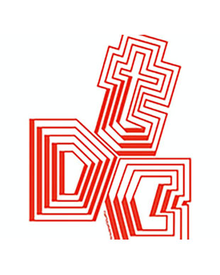
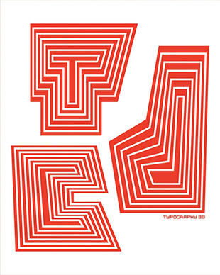
Figures 5 & 6: (Pentagram, P.Scher, Type Directors Club, 2012)
She even re-styled the New York City Ballet logo and gave it a long-lasting imprint on New York’s list of landmarks- This was exceptionally good for the company as years prior to Scher designing their current logo, the director of the New York City Ballet kept changing the logo every three years therefore, causing the business to be forgotten as they changed so much. When Paula Scher came in, she gave him three designs (all similar and could be used throughout all parts of the building, advertising, and merchandising) and they have been used for the New York City Ballet since 2008, almost 15 years.
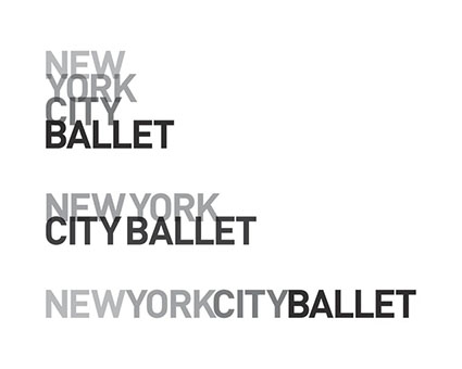
Figure 7: (Pentagram, P. Scher, New York City Ballet, 2008).
One of her most creative designs, I feel, is the branding she did for the Philadelphia Museum of Art. Philadelphia referred to this museum as the ‘Art Museum,’ and She transformed it from serious looking logo and focused on the A in ‘Art.’ Through this she was able to recreate the identity of the Philadelphia Museum of Art by using the shape of the A and replacing it with pictures/illustrations of mountains, flames and even art inspired by the likes of Piet Mondrian and other styles of art the museum showcased. (Paula Scher, Adobe Creative Cloud, 2020)
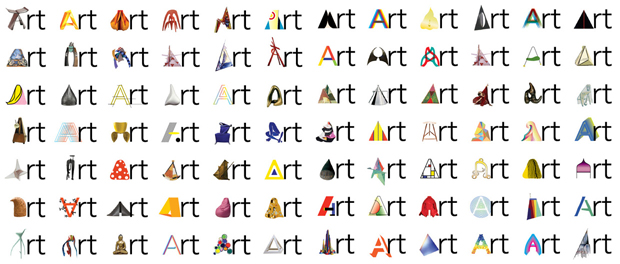
Figure 8: (Pentagram, P. Scher, Philadelphia Museum of Art, 2014)
Paula Scher has certainly made an impact on the world of design. Her most notable works remain instantly recognisable today because of the way she has designed them to represent the companies and the message they wished to portray. One of her most famous projects was Windows 8 as it was used by hundreds of millions of people who were Microsoft users. Scher kept the initial ‘window’ of the design but angled it to show a different perspective. Windows 8 was designed for people to use it as a tool to create and achieve their own goals correlating to Scher’s design system on ‘perspective’ for this project. Her aim was to create an interface using the influence of Swiss International Style design principles to create a modern geometric logo with clean-cut shapes and lines (Pentagram, 2012).

Another one of her pieces she is most known for is the branding she designed for the company Citibank. Citibank is New York’s first National Bank founded in 1998 when Citicorp and Travelers Group merged and Scher was called to redesign their brand. When they came to Pentagram, she designed their now notorious logo on a napkin in less than five minutes and sold the design for $1.5 million (Dwyer, 2017). She kept their signature blue which represented their visual identity and is also the colour of the wall behind the teller's desk. This shade of blue is Ateneo blue, and the red shade used is maximum red (Scheme Color, 2021). The red color was influenced by the red umbrella used in the Traveller’s logo. They styled the red arch over the ‘t’ to dot the ‘i’s creating a warm accent over the deep, rich blue typography. The font she used was ‘Interstate’ and used the ‘t’ from the Traveller's logo as a handle for the umbrella. (Fonts In Use, 2013). The colours show contemporary luxury in order to attract more customers as well as portraying how big and successful the company is as they are a global empire. (Pentagram, 1998).
As we can tell, Paula Scher is a master at her own craft. She is able to bring together different styles of typography, colour palettes and design structures to create each piece she makes. Her unstructured pieces are strategically designed through her eyes which is why the branding she makes for companies is so recognisable and appreciated today.
ADCGlobal. (2021) Hall-Of-Fame-Paula-Scher [online]. Available at: http://adcglobal.org/hall-of-fame/paula-scher/ [Accessed: 10 November 2021].
Artnet. (2021) Paula Scher Biography [online]. Available at: http://www.artnet.com/artists/paula-scher/biography [Accessed: 11 November 2021].
Design Indaba. (2021). In Studio with: Paula Scher [online] Available at: https://www.youtube.com/watch?v=P7V6yVMH1UY [Accessed: 12 November 2021].
Dwyer, N. (2017) 'The $1.5m napkin: Paula Scher’s 5 minute logo' Medium, [blog] 6 March. Available at: https://nedwin.medium.com/the-1-5m-napkin-abd2702927d0 [Accessed: 16 November 2021].
Famous Graphic Designers. (2021) Paula Scher [online]. Available at: https://www.famousgraphicdesigners.org/paula-scher [Accessed: 16 November 2021].
Fonts In Use. (2013) Citibank Identity [online]. Available at: https://fontsinuse.com/uses/5238/citibank-identity [Accessed: 15 November 2021].
Grammy. (2021) Paula-Scher-Artist [online]. Available at: https://www.grammy.com/grammys/artists/paula-scher/6099 [Accessed: 11 November 2021].
MoMA. (2021) Paula Scher, Arnold Rosenberg [online]. Available at: https://www.moma.org/collection/works/189254 [Accessed: 12 November 2021].
MoMA. (2021) Paula Scher, John Paul Endress [online]. Available at: https://www.moma.org/collection/works/189252 [Accessed: 12 November 2021].
Mundell Design History. (2017) Paula Scher: Design History Talk [online]. Available at: https://mundelldesignhistory.wordpress.com/2017/12/02/paula-scher/ [Accessed: 10 November 2021].
Pentagram. (2021) Paula Scher [online]. Available at: https://www.pentagram.com/about/paula-scher [Accessed: 10 November 2021].
Pentagram. (1998) Citibank Story [online]. Available at: https://www.pentagram.com/work/citibank/story [Accessed: 15 November 2021].
Pentagram. (1996) The Public Theatre [online]. Available at: https://www.pentagram.com/work/the-public-theater?rel=search&query=paula%2520scher%2520bring%2520da%2520noise%2520&page=1 [Accessed: 10 November 2021].
Pentagram. (2012) Windows 8 [online]. Available at: https://www.pentagram.com/news/windows-8-launches [Accessed: 15 November 2021].
Pentagram. (2012) Windows Story [online]. Available at: https://www.pentagram.com/work/windows/story [Accessed: 15 November 2021].
Scheme Color. (2021) Citibank Logo Colors [online]. Available at: https://www.schemecolor.com/citibank-logo-colors.php [Accessed: 15 November 2021].
'Paula Scher: Graphic Design' (2019) Abstract: The Art of Design. Series 1, episode 6. Netflix, 2019. [Accessed: 9 November 2021].
P. Scher. (2020), ‘Paula Scher: Twenty-Five Years at The Public, A Love Story’ New York: Princeton Architectural Press [Accessed: 9 November 2021].
‘Living, Breathing Brand Identities with Paula Scher,’ (2020), Adobe Creative Cloud [Accessed: 9 November 2021].